I've been to this house and I'm excited to see more of Heather's project. Let's pick-up where we left off. Where does this hallway lead to?
 |
| Architectural Photographs |
The stunning Hearth Room Kitchen
Heather used several Modellos in this project and not one to waste any materials, she used a leftover one above the fireplace:
And this is the kitchen...
 |
| Architectural Photographs |
I am a cabinet person and a patina person, and a stencil person so this whole kitchen sets my heart aflutter. Heather applied all the cabinet finishes. Let's take a look at the components.
The refrigerator cover with Royal Design Stencils used on the raised panels. I love when stencils are used to create an inlaid wood effect.
The island is our Harrison Crackle finish from Furniture Traditions class. When someone does a great application of a class finish I am so happy that it is a useful sample and it worked in the real world-whew!
But I can only teach techniques and product-the talent is Heathers.
Harrison Crackle is also used on the accent cabinet. The range area has many pretty finishes set off by the faux patina hood.
 |
| Architectural Photographs |
This is the sunroom off the kitchen. As Heather notes there is no faux but the colors are fun and the lime green, chocolate and grey blue are right on trend. Love the fan!
This is the Office Powder Bath that I will call the Jewel Bath. When you have a large home you need to give your bathrooms a name so your guests don't get confused. Such as "Oh, use the Jewel Bath or the Leather Bath." People visiting this home will just make excuses to use the bathrooms-each one has such a great finish!
This finish done with Lusterstone has a delicate relief pattern with jewel details. Heather shows you that a partial stencil pattern may be effective. This is a favorite pattern, Large Flourish, from Royal Design Studio, that I have used on several projects myself.
Here is a closeup of the ceiling finish, bronze trim, and more of the sparkle pattern around the doorway.
Next to this bathroom is an office with built in dark glazed cabinetry.
The walls are done is an animal skin finish with a chipped back plaster map on the ceiling.
The second powder bath on this level is a rich red tissue that Heather coordinated with the vessel sink. A nice twist to a tissue finish is placing a relief pattern under the tissue. Glazing the tissue will pick up the pattern.
 |
| Architectural Photographs |
Close-up of the relief pattern and the glaze colors:
 |
| Architectural Photographs |
The pattern picks up the scroll quite nicely. This is Royal Design Studio Large Florentine Scrolls-also a very versatile stencil. We will end this part of the tour in the Master Suite.
 |
Architectural Photographs
|
Now remember, Heather coordinated this entire project including the furnishings. The Master Suite is in soothing blue green and cream with warm taupe silver accents.
Isn't that a glamorous headboard? The walls have a soft woven treatment with a random pattern that fades in and out.
My favorite finishes for bedrooms are the ones that look like faded fabric or antique oriental carpets. I think we get hung up on strias or weaves that have to be perfectly horizontal or vertical-well good luck with that. This is a successful way to get the feel of wallpaper-like finishes without torturing the surface or your back!
This is a small hallway between the master bedroom and master bath area. It has a slightly stronger stria with the glaze colors matching those used in the bedding. I have to say I would love to have this bath even though my home is contemporary-maybe I could be tempted to change my whole house to have this bath..hmmm.
The wall treatment is similar to the master bedroom. Here the star is the vanity. Suzanne Lynch and Julie Reuter are the talented finishers that finished the wonderful cabinetry in this room. As I've said before-Kansas City is home to some of the best finishers I've ever met. Don't be fooled by the simplicity of a glazed cream cabinet-this is one of the hardest finishes to do well. If done poorly, the cabinets look dirty or uneven from piece to piece-white shows every blemish!
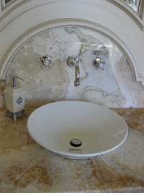
Nice job Ladies. The little pulls look like vintage button earrings. Heather went to great lengths to get this onyx for the vanity:
The effort was totally worth it. Isn't that counter design beautiful?
Next time, we have a choice. Where do we go next? Do we go up the stairs? Do we go down the stairs? How about I take a few days to decide while you take in all this pretty.


