There is the traditional color palette of red and golds with accents of black and cream. And there are roosters-which we both admit add to the look best when used in subtle places. But like most Americans take on a classic style from another country, Jane has added some contemporary and transitional finishes with pattern, and metallics. We are a melting pot after all.
Let's take a tour:
This is the dining room which started out with "baby poop" painted walls. Lots of our finishes start out with baby poop colors-think a baby that has eaten lots of spinach.
"I yam what I yam"
Over the greenish brown color, we applied Faux Effects Metallic Bronze and Gold Fresco. The key to this product is to thin it with water (25%), brush in small areas, and pop it with a plastic bag. Then we pull it out with a foam brush. The finish has movement but is flat on the wall.
On the ceiling, we painted it with Bronze Setcoat and lightly applied the gold fresco. For the ceiling medallion, we applied a Modello from Royal Design Studios. These are custom sized adhesive masking patterns and they make working over your head much much easier.
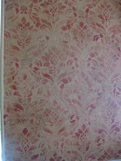
We based the breakfast nook finish on a wallpaper that Jane liked but was not available in the colors she needed. That is an advantage for a faux finish-custom colors. We painted the walls first with Black Setcoat and then rolled an even layer of Aquasize.
The stencil is Royal Design #501 Damask-I call it the Artichoke Damask. French Red Faux Creme Color is applied with a foam roller over the stencil. Varying the pressure of the roller will create the faded look of the pattern. I mark the stencil with a large arrow pointing up. This way I don't turn the stencil while I am working-nothing worse then realizing you have applied areas of your pattern upside down. When the stencil is dry, the surface is glazed with a mix of Rich Brown Stain & Seal, American Walnut Stain & Seal, and FX Thinner. We just helped a finisher this morning adapt this finish to chocolate, bronze, and gold.
Also in the hearthroom kitchen is a built-in TV cabinet that was a little too gold. After cleaning and sanding the piece, I painted it with a thin layer of Camel Setcoat. I stippled on some Camel tinted Duraseal for a crackle look without the actual cracks. Since we wanted a rubbed back look, I brushed a thin layer of Creme Activator over the entire piece. The biggest mistake people make with Creme Activator is applying it too thick. It dries to a milky film if you put too much on. I brush or roll my coat, and then roll through with a dry foam roller to really lay it out. You should barely see it on the surface. When the Creme Activator is matte, then I applied Black Setcoat. As the Setcoat dried, I just rub through to the under color.
Our next project is a powder bath. I love it when a client will go with a black background. Don't get stuck on dark. Instead think of the finish as "rich." The walls are Black Setcoat. We used a favorite Royal Design Stencil #724 Fabric Damask applied in a broken pattern.
Tara used Gold and Silver Stain & Seal for the design. When this was dry, she applied the same Bronze Metallic Fresco used in the dining room over the whole surface. This is an adaption of a finish that we did with Deb Drager in Wichita as part of a design collection project. Her original finish is in eggplant but lends itself to many rich tones including Dark Brown and Leather Red. This is still a favorite finish many years later.

Here is a close-up of the finish. We apply most of our Lusterstone this way because the colors may be stacked, it may go over a slight texture, and you can hide flaws and seams in the wall. A flat bladed Lusterstone will only make dry wall lines appear worse!.
The Champagne Foil matches her paint colors really well. Many times a wall will seem flat but it really has a stipple from the paint application. That was the case here. I ended up rolling two coats of Wundasize before applying the foil. Since the base color was close to the foil color, I didn't need 100% solid off-load of the foil.
This large wall took less then a single roll of 12" X 100 ft and less then 1 quart of Wundasize.
This stencil is Cutting Edge's Trellis. I've used this stencil many times including in my own home. I start the pattern in the middle of the wall and rolled Leo Gold Metal Glow over the pattern. Alternating side-to-side and up-down gives the pattern time to dry.
And this is the finished project. The flash to the right is where the sun is hitting that area of the foil and is the beauty of a finish like this-it changes throughout the day. If your client wants it to look the same all day in every light-get wallpaper.
Lucky for me Jane wanted a decorative finish for the very reason that it has some life. She called the next day (I always hold my breath a little when a client calls) to tell me that she loves it and can't wait for the next project! Whew.


